5 Product Designs We Love
Awesome products deserve to be appreciated, so as an exercise we put together a quick list of some of our favourite product designs — both past and present — to try to get at what makes a product great.
It’s something we think about a lot at Cortex: why do some products fail to resonate, while some succeed? What is it about certain special products that allows them to vault themselves into the pantheon of pop culture and seep into the fabric of our lives?
The best product designs have a few things in common. They look contemporary no matter how long they’ve been on the market. They’re made of honest, durable materials. Their meaning increases the longer you have them, and the very best products achieve something greater than the sum of their function and aesthetics to say something about who you are as the person who owns them.
Here are 5 product designs — some classic, some contemporary — that inspire us at Cortex to try and create work that will stand the test of time.
#1. Zippo Lighter:


Product Category: Tool
Year Introduced: 1936
Design Aesthetic: Utilitarian. Timeless. Functional.
Key Features: Flip top, spring-loaded toggling cam, wick-fed flame, “windproof” fire starting.
Why We Love it: The Zippo makes you want to find a reason to use it, and maybe there’s no bigger possible endorsement of a product than that.
Zippo lighters are a truly iconic product with a primal, elemental appeal. They’re a prototypical example of something we love to talk about at Cortex: the minor magic that happens when a product gives you a real moment of delight when you use it. You use a Zippo because you need fire, but you love your Zippo because it makes the moment you flip it open feel significant.
A Zippo is a portable, highly-engineered, wick-fed candle that demonstrates the principles of combustion every time you use it. Unlike a Bic, there is no valve to press down to keep it lit. It’s satisfying to flick it closed to extinguish it, and it gets hotter the longer it’s lit, giving you a constant tactile response that perfectly fits its function. It’s made of materials that feel indestructible, and its surface takes on a patina the longer you have it. It only gains personality, and it makes you want to keep up the small rituals of maintenance that will make it last forever.
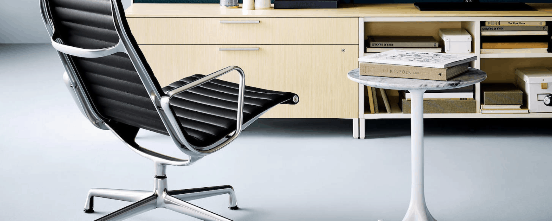
#2. Eames Aluminum Group Management Chair:


Product Category: Furniture
Year Introduced: 1958
Design Aesthetic: Modern. Minimal.
Key Features: Cast metal, suspended upholstery.
Why We Love it: Imitation is the sincerest form of flattery. By that measure, this chair must be one of the most flattered pieces of furniture in history. It’s the simplicity and honesty of Charles Eames’ original design for this classic task chair that makes it so much more special than the thousands of knock offs it inspires.
Unlike other furniture that hides its structure with upholstery, this chair celebrates its’ structural elements. Whereas the knock-offs use bent tube for the stretcher, riveted into place, the original design uses cast metal to form a continuous loop that gives this design a lot of its poetic quality. Think about how simple it is to draw this chair, and you start to see the genius in the constrained lines that give this design its form. Beyond that, the Management Group Chair’s suspended upholstery makes it comforting and comfortable, and — like so many timeless products — the leather takes on a life of its own with continuous use.
#3. Tristan Zimmerman’s “Radio Canada”:


Product Category: Electronics
Year Introduced: 2010
Design Aesthetic: Warm. Witty.
Key Features: CBC logo speaker grille. Custom volume knob. Custom Radio 1 and Radio 2 toggle. Steam-bent plywood and brake-formed sheet metal enclosure.
Why We Love it: This product says something about who you are if you own it. Designed for the certain kind of Canadian who jokes — but isn’t quite completely joking — that they only listen to CBC, this radio has a simple toggle for CBC Radio 1 and Radio 2, with a programmable dial on the underside to change those presets to the right frequency wherever you are.
Unlike the universality of some of the other products on this list, this radio is a total love letter to a certain niche kind of person. It’s designed to resonate with CBC listeners, but even if you’re not as obsessed as the average Canadian, it’s still a badass radio made of simple, honest materials. It conveys warmth and genuine admiration for its analog roots. The hits of red on the level meter and knob are subtle references for those who get the joke, but the whole thing is funny, cheeky and beautiful — a nod to a classic aesthetic that still seems modern.
#4. 3M’s Littmann Cardiology III Stethoscope:


Product Category: Medical Device
Year Introduced: 1967
Design Aesthetic: Functional. Utilitarian. Warm.
Key Features: Tuneable diaphragm.
Why We Love it: The Littman is a more unassuming product design that’s nevertheless a total icon in the world of medical devices. 3M acquired this design from David Littmann in the 1960s because it offered vastly improved acoustics over previous stethoscopes. Now, it’s a common graduation present for new doctors and nurses. It comes in a huge array of different colours, and the fact you can get it personally engraved says a lot about the meaning that the Littmann has for many medical professionals.
A great episode of design podcast 99% invisible (no really, click on the link and check it out) describes how the stethoscope is an intermediary for a medical professional to lay their hands on a patient — the most fundamental part of most medical examinations. It’s a symbol for the intimacy and listening involved in proper medical diagnosis. This is a timeless product design because it’s a recognized marker of trust: if you were going to pretend to be a doctor, this is the first thing you’d put on.
From a design perspective, the Littmann stethoscope is the standard by which other stethoscopes are measured. It’s durable, precision-machined, polished, and easy to clean. It lasts forever, and there’s something satisfying about its lack of electronics. It’s hard to imagine that medical professionals won’t still be using stethoscopes that look like these fifty or a hundred years from now.
#5. Nest 3rd Generation Thermostat:


Product Category: Home Electronics
Year Introduced: 2011
Design Aesthetic: Bold. Rich. Solid.
Key Features: 2.08’’ LCD Display, Large-Format Directional Button, Polished Steel and Glass Enclosure, WiFi Connectivity, Remote Monitoring.
Why We Love it: The Nest Thermostat sits at the intersection of the past and the future. It’s an homage to the classic Honeywell Thermostat that also blows every other piece of beige wall-mounted plastic out of the water from an aesthetic standpoint. Where most previous thermostats tried to blend into the wall with a non-colour that ended up being offensive, the Nest announces itself as something to be interacted with, and then proceeds to make that interaction fluid, intuitive, and satisfying.
Its polished metal and glass makes it feel like a luxurious object to hang on your wall. The knob has a heft and a weight that’s a delight to use compared to the confusing array of multi-purpose buttons on previous thermostats. Then, after it learns your behaviour, you don’t have to interact with it at all.
The Nest references the classic Honeywell design that places both the current temperature and target temperature on the same surface. It takes the Honeywell and turns it into the thermostat it always wanted to be, which shows the power of referencing timeless designs even when you update products for a more connected age.
These are five of our favourite examples of all-time excellence in product design, but the list is of course not exhaustive. Sound off in the comments with any other great product designs — either classic or current — that hit particularly close to home!
Dylan Horvath is President of Cortex Design, a turnkey product designs and manufacturing firm based in downtown Toronto. We visualize human experiences, design the product to support that experience, and manufacture the solution. Let’s talk about your product design challenge!