Huron Technologies
Huron Technologies
How Cortex Used Design to Turn Huron Technologies’ Fragmented Portfolio Into a Cohesive Product Family
From Fragmented Portfolio to Cohesive Product Family
The Problem
Many MedTech portfolios grow faster than they align.
Products emerge from parallel R&D efforts, shifting priorities, acquisitions, and legacy platforms. Over time, that creates design debt: machines that share technical foundations but look and feel unrelated in the market.
That inconsistency has a cost. It confuses customers, dilutes brand equity, and lowers the perceived value of high-tech equipment. In many cases, the portfolio also looks outdated and fails to communicate the sophistication of the underlying technology or the strength of the company’s value proposition. For leadership teams trying to support rapid portfolio expansion, enter new accounts, or integrate acquired product lines, visible inconsistency can signal internal misalignment.
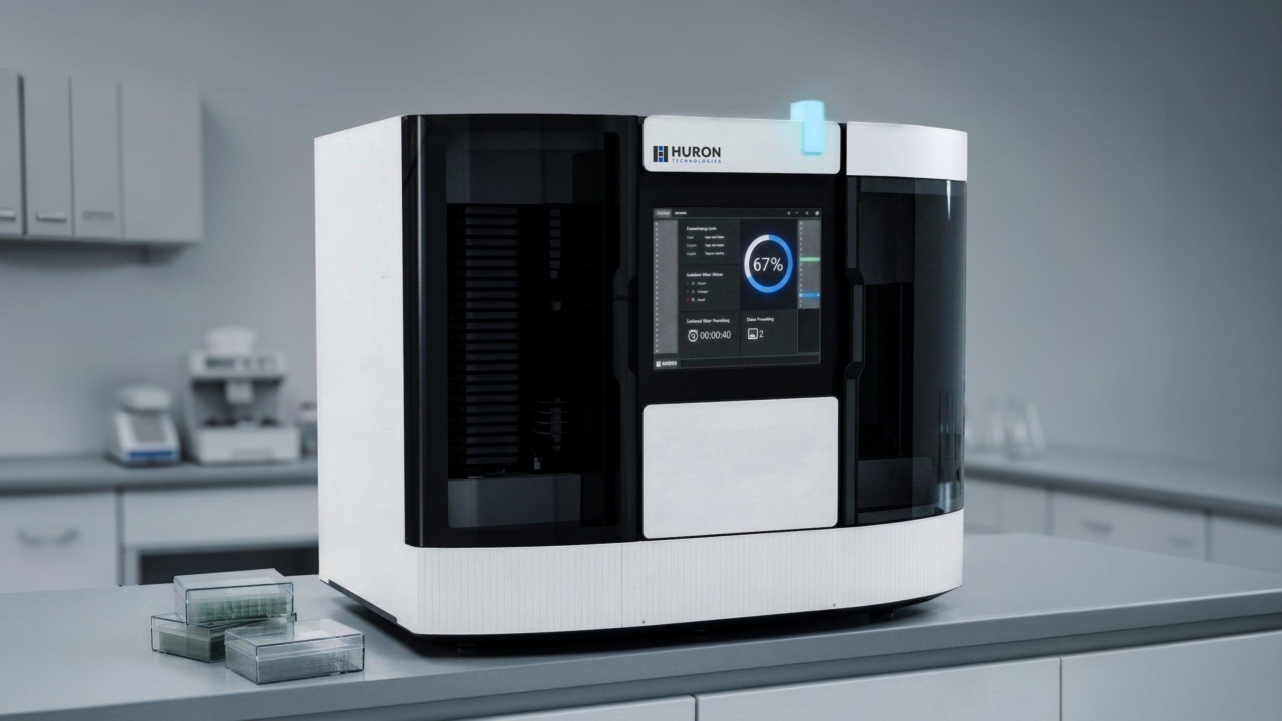
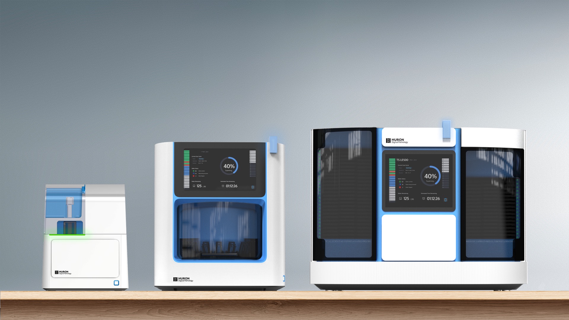
Huron Technologies faced that challenge as its digital pathology portfolio expanded across multiple machine types. The goal was to create a unified identity that aligned the portfolio, modernized how the systems were perceived, and better communicated the value of the technology behind them.
TL;DR
- The Challenge: Huron Technologies needed to harmonize a diverse machine lineup into a single, premium product identity.
- Cortex’s Role: Cortex Design created a scalable Visual Brand Language, translated it across multiple systems, and developed the external product architecture around Huron’s internal system architecture.
- What made the difference: Cortex turned design direction into a repeatable framework of design rules, enabling consistency across the portfolio while improving usability and creating a scalable, production-intent framework for future development.
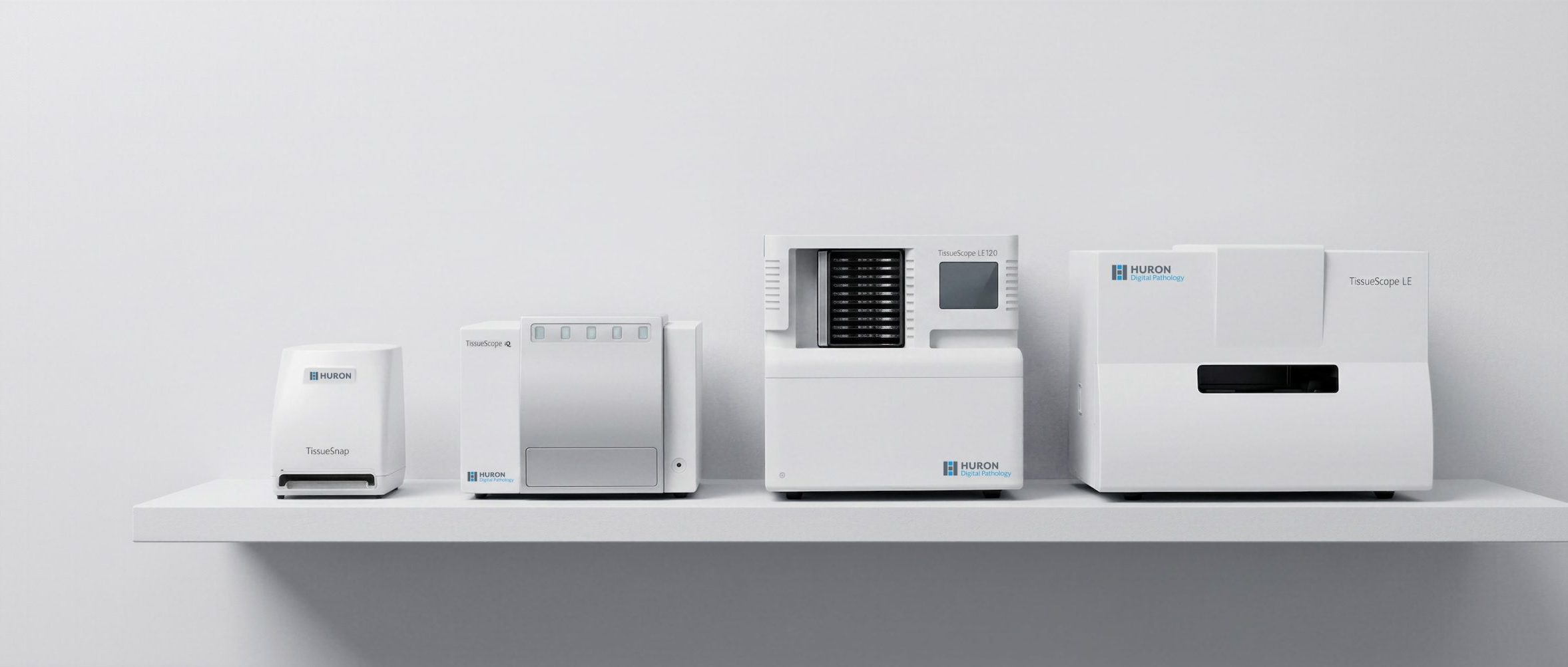
- The outcome: In four months, Huron brought three systems to trade-show-ready prototype level as a more cohesive product family and gained a scalable system to guide future product development.
Turning Design Into Brand DNA
A coherent portfolio does not come from repeating the same enclosure across every machine. It comes from defining the rules that make products feel related.
For Huron Technologies, Cortex moved the design language away from generic medical cues and toward a distinct visual DNA. Cortex used geometric form, lighting behavior, surface control, and interaction cues to communicate precision, trust, usability, robustness, and high throughput.
That distinction mattered because the category often hid compelling technology behind anonymous shells. Cortex identified a black box effect early: sophisticated internal systems did important work, but the products did little to express that capability. The opportunity was to create a visual language that made the technology more legible and more distinct without compromising IP protection.
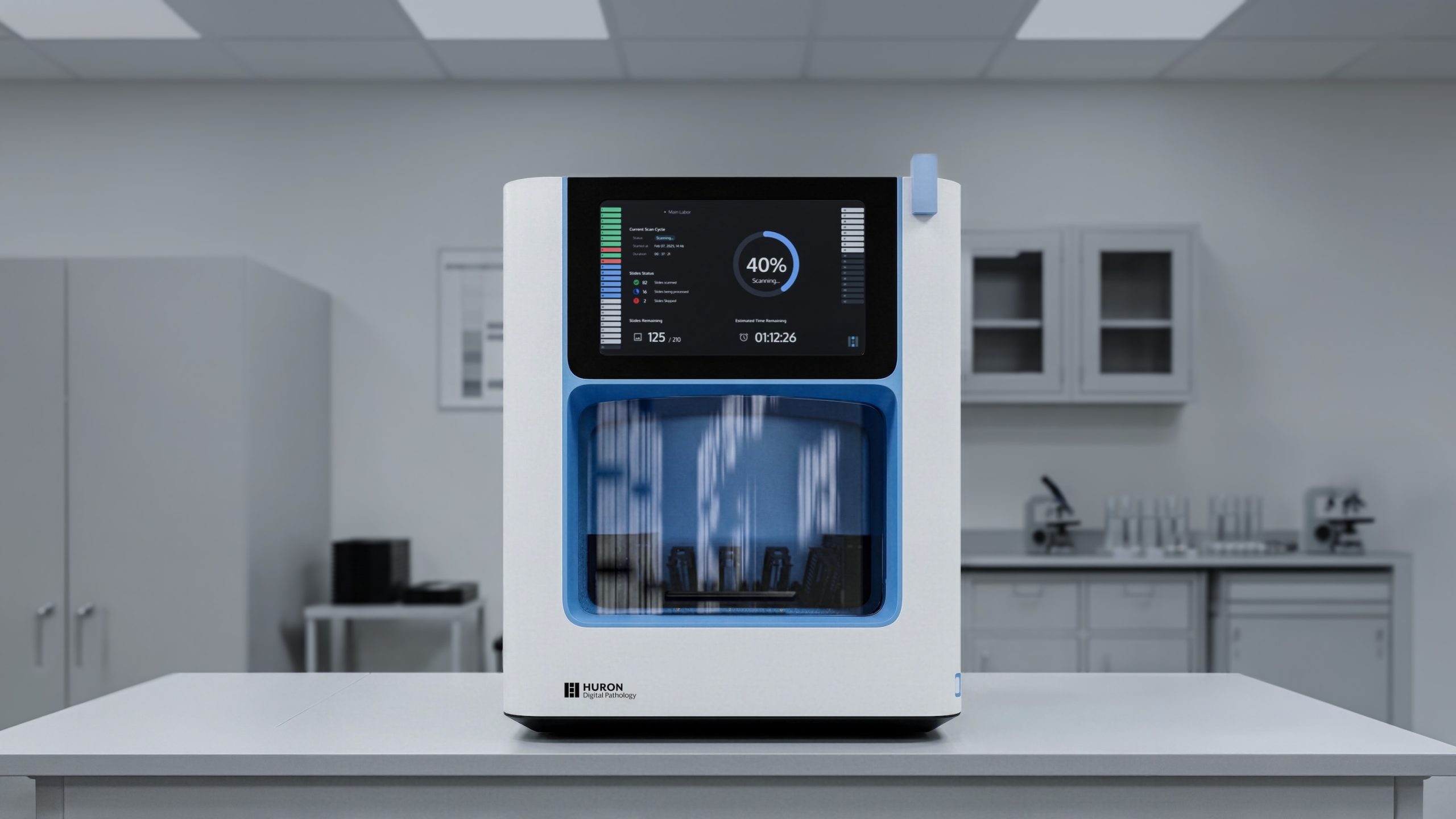
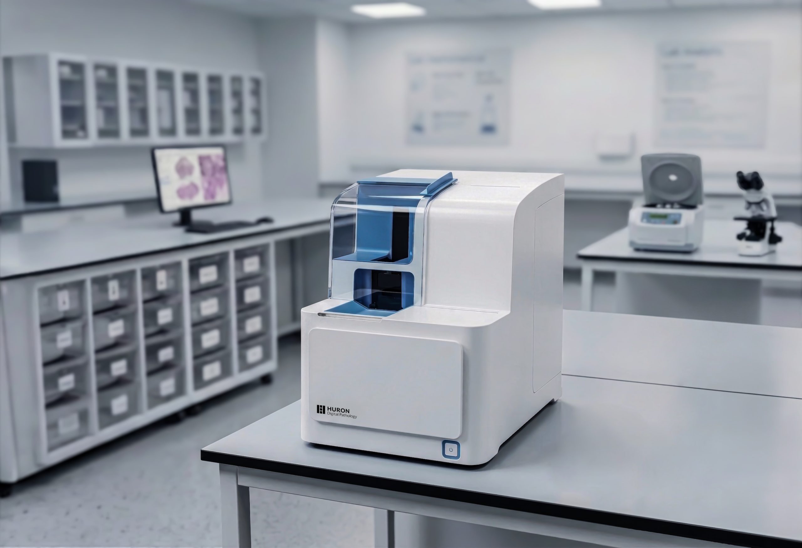
This work established a Visual Brand Language that differentiated Huron in the market while aligning the portfolio internally.
The result was a system that gave each machine its own role while making the full lineup feel like one product family.
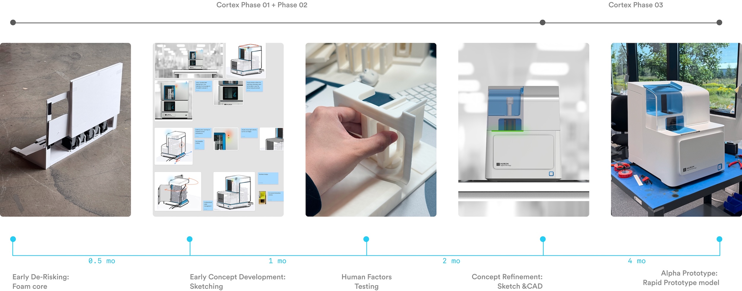
A Four-Month Acceleration
Month 1 — Strategy
Cortex began by auditing the portfolio and defining the north star for Huron’s Visual Brand Language.
Cortex reviewed the existing product range, identified the sources of visual fragmentation, and defined the strategic role the new design language needed to play. The category presented a familiar problem: a sea of visually similar machines dominated by dated white and grey devices that did little to distinguish one system from another.
For Huron Technologies, that created a clear opportunity. The goal was to move beyond generic clinical design cues and create a Huron-specific identity that better communicated the value of the underlying technology and the company’s core product principles: usability, robustness, and high throughput.
Month 2 — Ideation
With the strategic direction in place, Cortex translated visual territory into physical form.
Cortex turned mood boards and reference imagery into machine architecture by defining proportion, geometry, touchpoint hierarchy, lighting, and surface logic. The result was not a style study, but the beginning of a product design system.
Month 3 — Validation
Before moving into high-fidelity development, Cortex used rapid sketching, physical mockups, and fail-fast prototyping to test the design in use.
The team evaluated ergonomics, access points, sightlines, and interaction clarity early, before those decisions became expensive to change. Cortex built human factors into the process from the start, including physical interaction studies based on broad user accommodation targets.
Month 4 — Execution
In the final phase, Cortex refined the system and prepared it for launch.
Cortex developed production-ready CAD for the enclosure, high-fidelity visual assets, and trade show prototypes that allowed Huron to present the new product family with clarity and confidence.
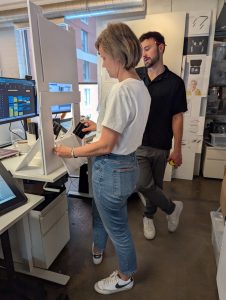
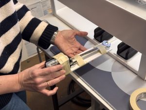
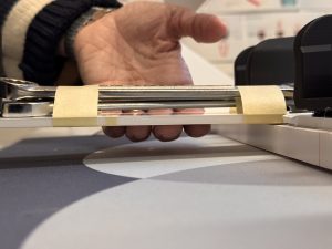
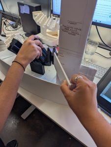
Human Factors Testing for Cartridge Loading and Visibility
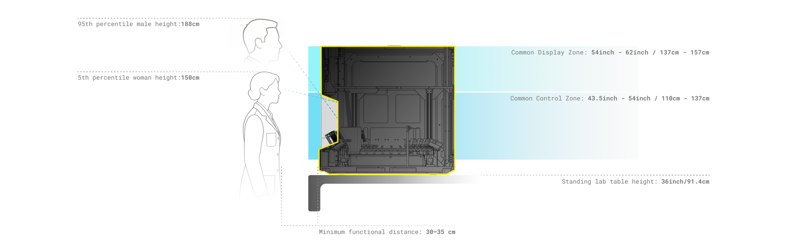
Human-Centric Validation
Cortex used fail-fast sketching and physical mockups to test ergonomics before committing to high-fidelity development.
Human factors callouts guided decisions about display placement, cartridge access, control visibility, and physical reach. The design process considered broad user accommodation targets, including fit and access for large-body users, so the machines would feel intuitive in real-world operating conditions.
The result was a cleaner interface between user and machine, shaped by evidence rather than assumption.
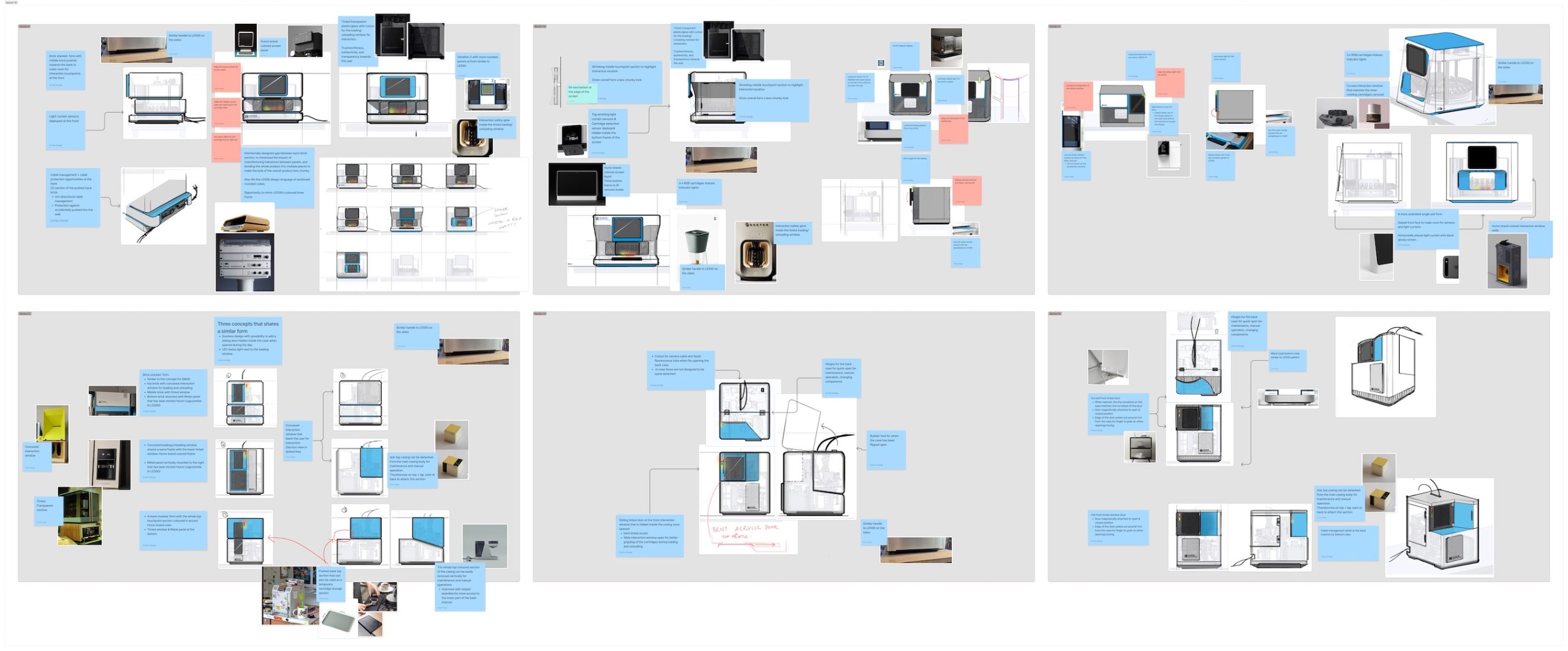
Phase 01 Early concept development
Industrial Design That Unified the Portfolio
This was not a styling exercise.
Huron Technologies owned the internal system architecture. Cortex had to design the external system architecture around it.
That constraint revealed the value of the work. Cortex was not applying a new skin to a finished machine. Huron brought the internal system expertise; Cortex added the industrial design capabilities needed to turn that technology into a more coherent commercial product family.
At the same time, Cortex used industrial design to drive changes that improved usability. Cortex designed around Huron’s internal framework to optimize the outer shell for use: access geometry, status visibility, touchpoint placement, sightlines, handle integration, and maintenance zones were resolved as part of the architecture, not layered on afterward. The goal was to create clearer cues for how to use the system, not just a cleaner exterior.
That is where industrial design delivered operational value: it made the machines easier to understand, easier to use, and more credible as commercial products.
The Design Rules System
The most durable outcome of the engagement was not a single product design, but a system of design rules.
Cortex established a scalable framework for how Huron machines should look, communicate, and behave. Cortex applied those rules across the portfolio through recurring principles: shared geometric logic, consistent interaction touchpoints, aligned lighting behaviour, and a recognizable physical stance.
This created the hardware equivalent of a design system.
Visual Brand Language was not only about what users saw on the surface. It also shaped how users understood the product through interaction. Maintaining a consistent visual language created predictable UX patterns across the portfolio: color cues for interaction, status lights with the same functions, and handles and components used in the same way from one machine to the next.
Instead of starting from zero with every new machine, Huron now had a framework that could accelerate future development, improve consistency across the portfolio, reduce the time required to align new products, avoid reinventing core design decisions, and reduce user friction and training.
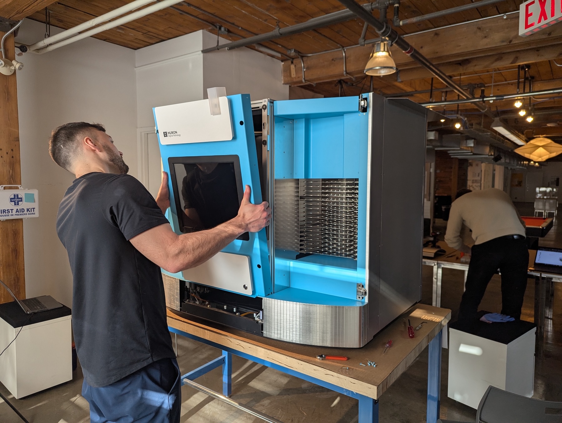
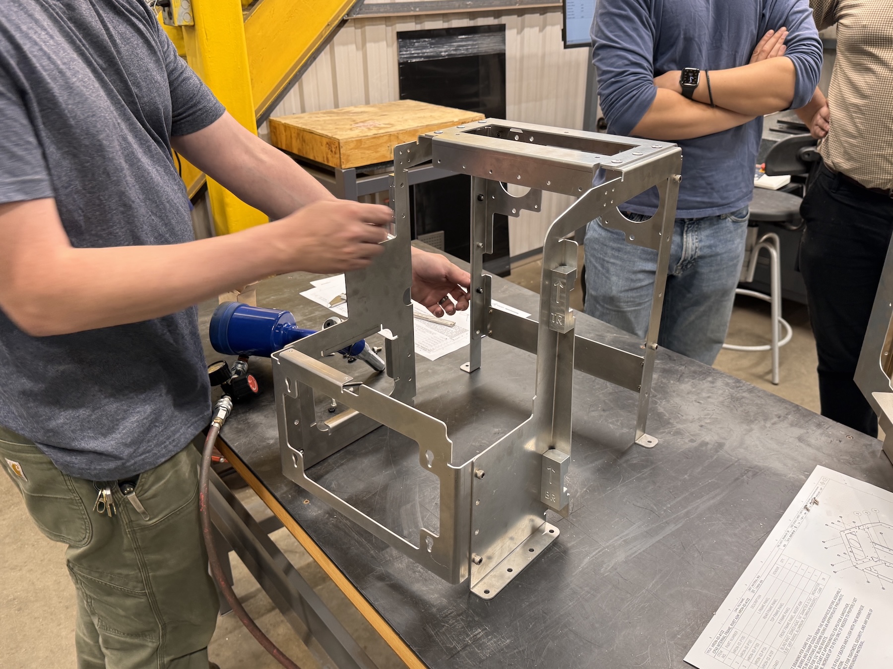
Design Engineering and Prototyping
Cortex then translated that design intent into an external architecture that worked with the realities of the internal system and preserved the user experience.
The team developed an enclosure framework that functioned as an exoskeleton, supporting the outer panels, preserving service access, and maintaining the intended visual language.
The team validated that integration early. The first prototypes went together and worked on the first build, reflecting the rigor of Cortex’s engineering process and the quality of integration between the enclosure and the internal system. For Huron Technologies, that created early confidence, eliminated rework, and protected the program schedule.
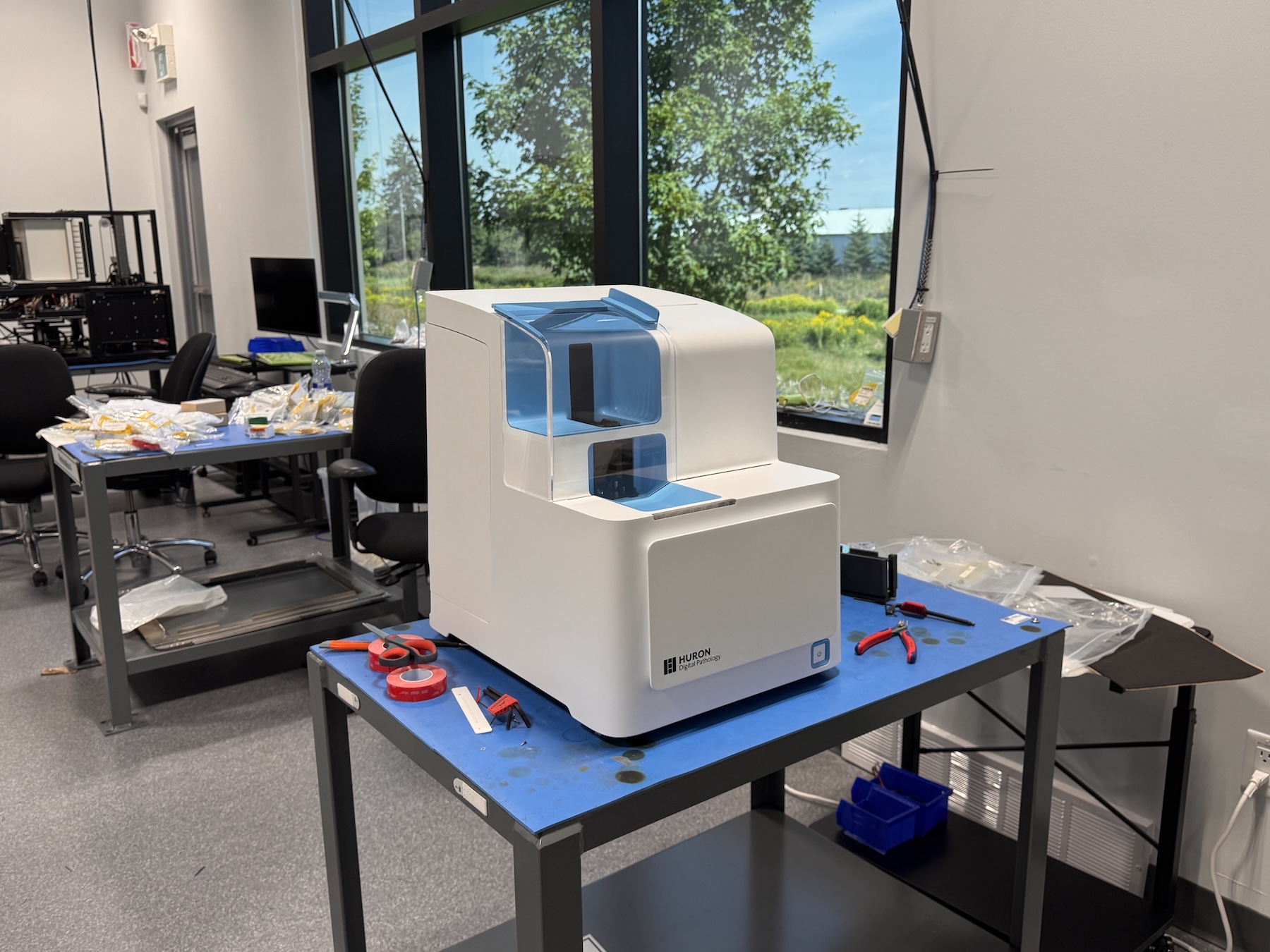
Result in Market
Cortex delivered more than a new visual language. The team supported prototyping, enclosure development, and design-for-manufacturing work that translated the new brand direction into a credible product path.
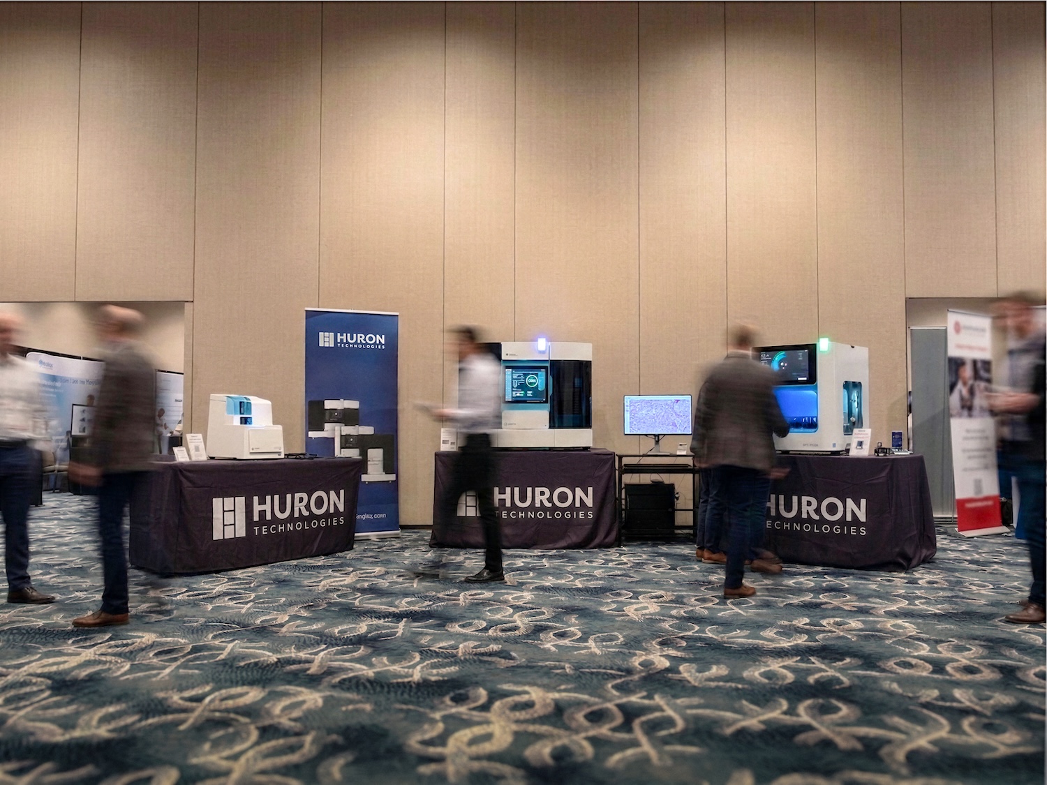
In four months, Huron Technologies brought three systems to a major industry event as a recognizable product family rather than as unrelated machines. That speed came from bridging concept and execution: Cortex developed an alpha trade show prototype, supported a production-intent prototype, and refined the enclosure architecture without losing the core design intent.
That presence changed how the portfolio was perceived in the market. On the trade show floor, the systems signaled stronger internal alignment, greater design maturity, and a clearer market position.
For Huron Technologies, the result was a portfolio that looked current, better expressed the sophistication of the underlying technology, and made each machine recognizable as part of one family.
The work also created operational value beyond the launch. By aligning materials, suppliers, and design decisions across systems, Cortex established a more scalable development model. The Visual Brand Language reduced the need to reinvent core decisions on future programs and gave Huron a clearer framework for integrating future products into the portfolio.
For enterprise MedTech teams managing legacy design debt or fragmented product lines, that is the larger value: not just a cleaner portfolio, but a more credible, scalable product family that reinforces brand equity at every touchpoint.